● Concept · residential real estate · 2026

Maison Mare

A real-estate launch page in three palettes, built from a designer’s screens as a frontend exercise

Client
Maison Mare
Discipline
Frontend Development
Sector
Concept · residential real estate
Year
2026

Visit mare.karinnasrallah.com

Maison Mare · A real-estate launch page in three palettes, built from a designer’s screens as a frontend exercise

Overview

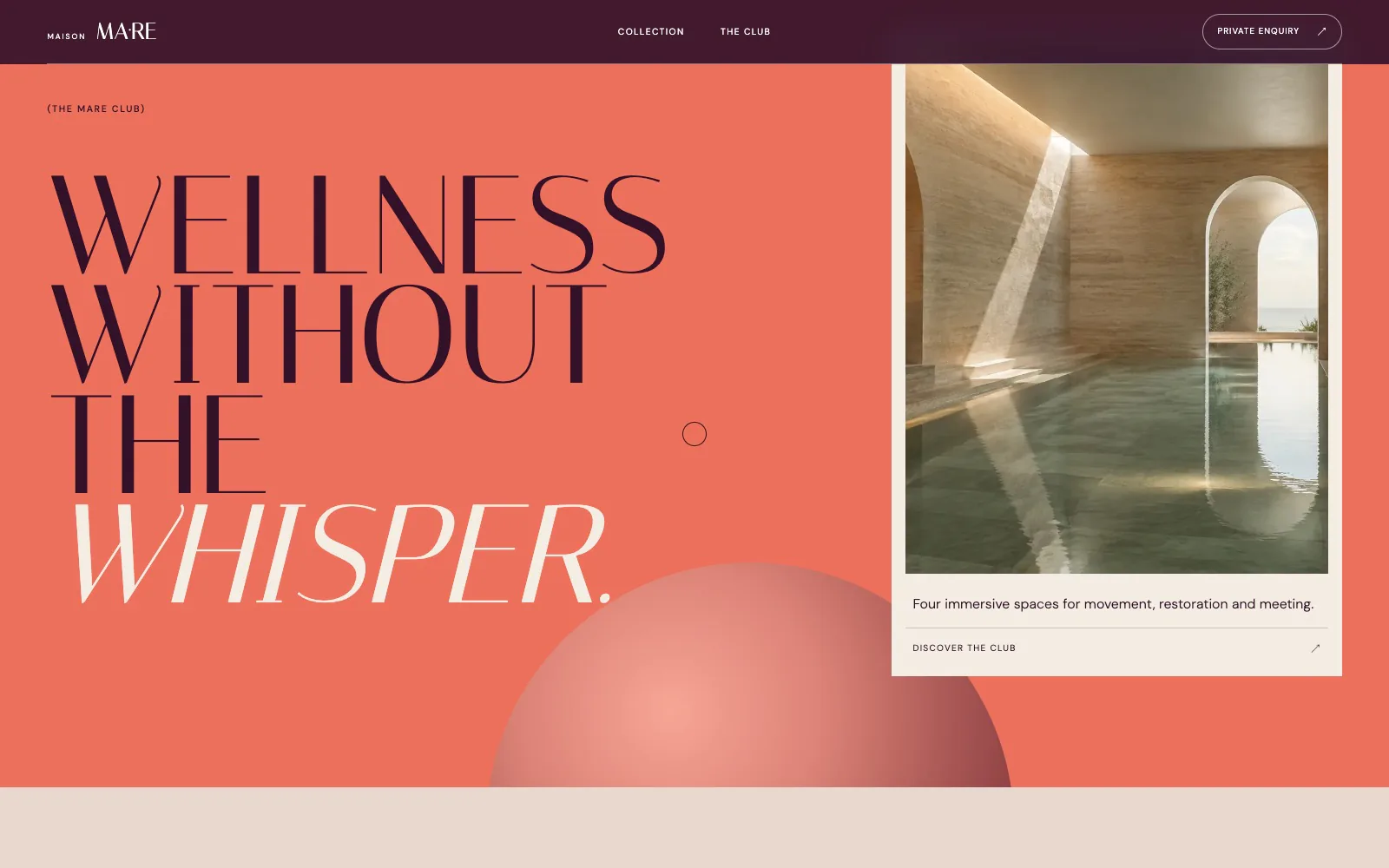
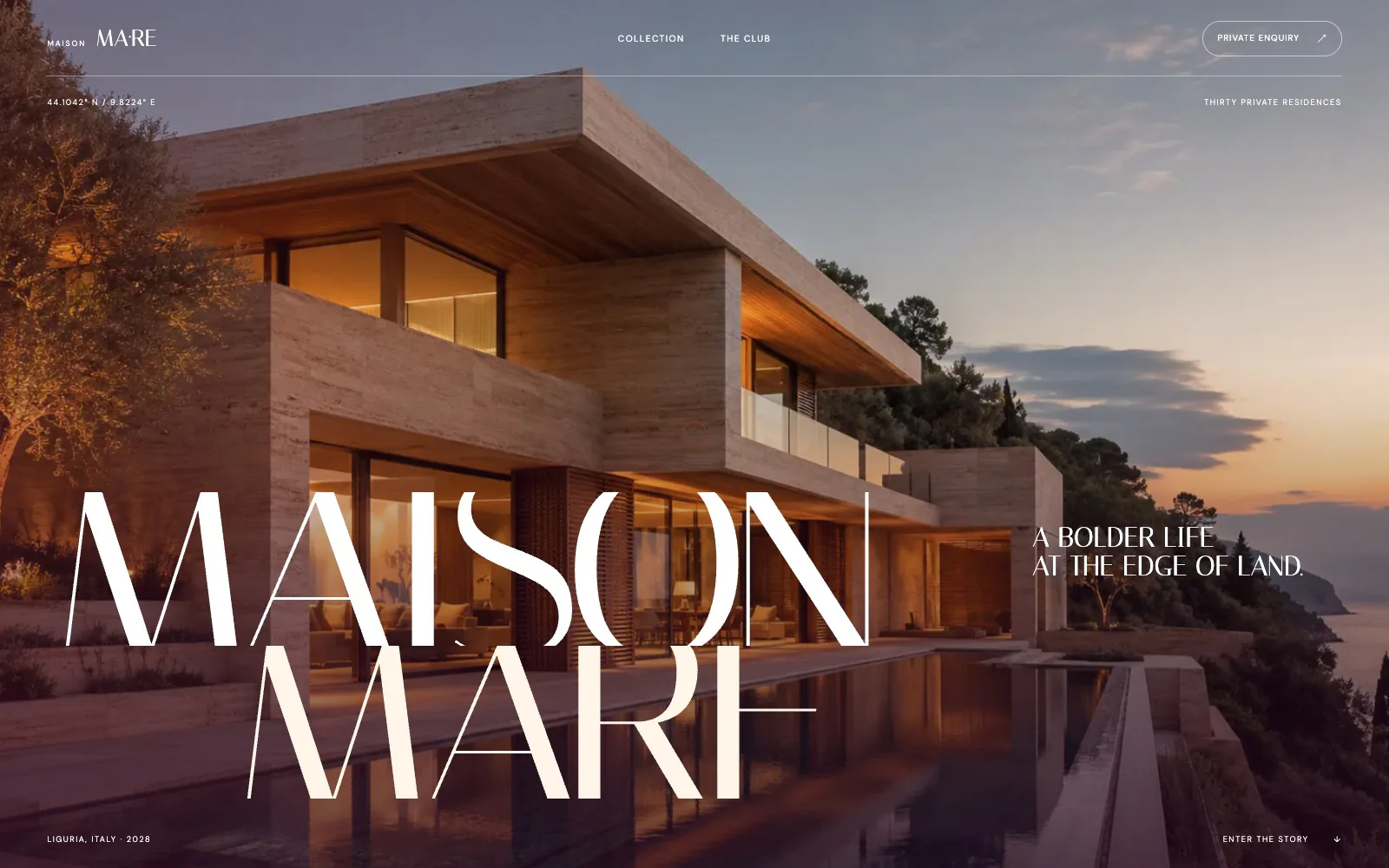
Most of my implementation work sits on one palette. This design runs four: dusk photography, a deep plum, a coral block, then cream, and every section changes the type colour, the rules, the buttons and the way the image is framed to suit its ground. The design is Karin Nasrallah’s. Building it was a lesson in structuring CSS so that the palette is a property of the section, not a set of one-off overrides, and in matching an expressive display serif’s spacing so the giant MAISON MARE lockup reads the way it does in the mockup.

Services

  • Design-to-code implementation
  • React component build
  • Theme-per-section CSS architecture
  • Hand-written scroll interactions

Stack

React · Vite · CSS custom properties · No animation library

Karin

Design by

4

Section palettes

211 KB

Main bundle

2026

Delivered

01

Palette as a section property

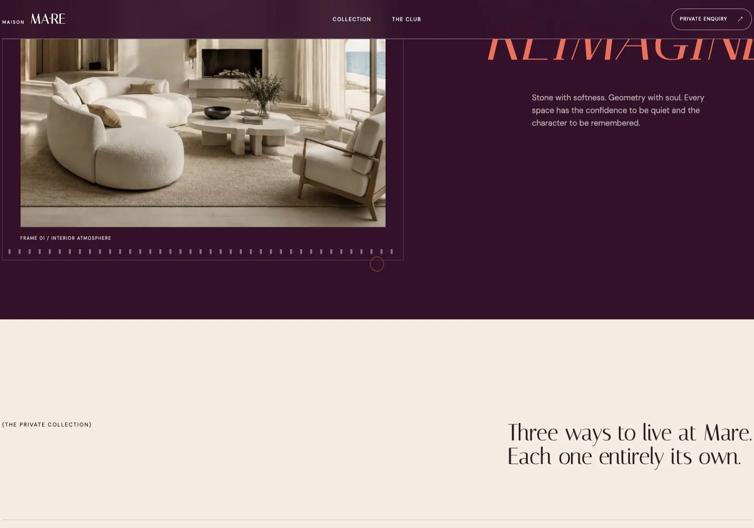
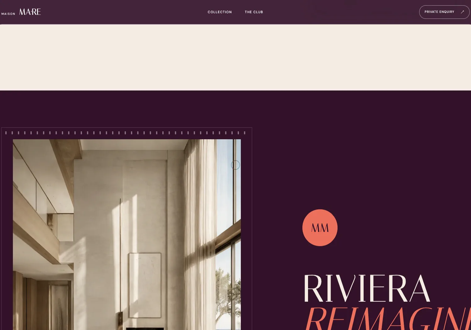
Each section carries its own set of CSS variables (ground, ink, accent, rule) and every component inside reads from them. The plum gallery, the coral club and the cream collection are the same components; only the variables change. One place to tune, no cascade of overrides.
Maison Mare · Palette as a section property

02

A filmstrip that scrubs

The interior gallery sits in a frame with a sprocket rail and a frame counter, and moves as you scroll through it, all hand-written, driven by scroll position and React state, with the same restraint as the rest: one easing, no bounce.

Maison Mare · A filmstrip that scrubs

03

Big type without breaking

The residence names, the coral WELLNESS WITHOUT THE WHISPER block and the hero lockup all run close to the viewport edge on purpose. Making that survive every width (clamps, tracking, deliberate line breaks) was where most of the layout time went.

Maison Mare · Big type without breaking
Next projectKarin Nasrallah